EverWhen · Brand & interface specification
How this product
should look, read
and behave.
EverWhen is a safety product for people who live alone and the people who would want to know. It is used at 6am by someone who has not put their glasses on, and at midnight by someone who has just been woken by a text. Everything specified here follows from those two moments. Where this document and a visual preference disagree, this document is the one that keeps somebody safe.
Prints to A4. Colour values, tints and screenshots are preserved — set your print dialog to Background graphics: on.
Human before technical.
Would a kind neighbour say it this way?
Understood in one read, at arm's length.
Does it survive being read once, without glasses?
Serious without manufacturing panic.
Does it raise the pulse of someone who is already worried?
Independence is the point, not the risk.
Would the person it describes be happy to read it?
Design for trust, not for attention.
When two options are close, take the one that is easier to read, steadier under stress, and less likely to make someone feel managed.
everwhen.io/brand-guide · 1.0 · August 2026
Who reads this screen
Two people use EverWhen, with opposite needs, and neither of them is a designer's default user. Every rule further down exists because of one of them.
The owner
- Age
- Typically 70–90
- Holds
- Their own phone, often at the largest text size the OS offers
- Opens it
- Once or twice a day, on a schedule they chose
- Wants
- To be left alone, and to know someone would notice
- One screen, one obvious thing to do on it.
- Readable at arm's length, without reading glasses.
- No word that would appear in a discharge summary.
- Nothing that reads as surveillance, scoring or supervision.
The helper
- Age
- Typically 40–65
- Holds
- A phone between meetings, or a laptop at work
- Opens it
- When something changes — usually because we texted them
- Wants
- One answer: is everyone alright?
- People first. An incident list is not a home screen.
- Density is allowed. Alarm is not.
- Every alert names a person and one action.
- Silence must be stated out loud, not implied by an empty list.
Constraints that outrank taste
Five rules that are not up for negotiation in a design review. They are listed first because everything after them is downstream.
Clarity beats every other value
When a visual choice and a comprehension choice conflict, comprehension wins without discussion. A missed check-in nobody notices is the failure mode this product exists to prevent.
We are not an emergency service
No screen, badge, icon or sentence may imply that EverWhen dispatches an ambulance. Getting help means reaching a person's own care network. Anything describing a serious situation names 911 explicitly and separately.
State is never carried by color alone
Around one in twelve men has a colour-vision deficiency, and contrast sensitivity falls with age. Every state is a shape, a word and a colour — in that order of importance.
Nothing important hides behind a gesture
Swipes, long-press menus and hover reveals may not be the only route to anything urgent. Discoverability is an accessibility requirement here, not a nicety.
Copy is design
The words are specified in this document alongside the pixels because on a lock screen at 3am the words are the entire interface.
Typeface
The mobile app deliberately ships no font files. It renders in the platform's own system face, which is the face the operating system's accessibility text sizing was designed and hinted for.
What runs where
Good morning, Evelyn
Your next check-in is at 11:30 AM.
SF Pro on iOS · Roboto on Android · your own system face here
Good morning, Evelyn
Your next check-in is at 11:30 AM.
Identical everywhere
Why the system font, and not a brand face
An owner reading at 200% text size gets correct optical sizing, correct line breaking and correct numeral alignment for free, because the OS tunes its own face for exactly that. A licensed display face would look more distinctive and read worse — and reading is the product.
Inter is the web stand-in because its metrics sit close to SF Pro, so a screen mocked in one does not shift when built in the other. Design mobile work in SF Pro; design web and marketing in Inter.
Substitution stack for web assets
font-family: Inter, -apple-system, BlinkMacSystemFont,
  "Segoe UI", Roboto, "Helvetica Neue", Arial, sans-serif;
Setting rules
- 01Sentence case everywhere. ALL CAPS appears only in the 10px monospace labels used in tooling and this document — never in product copy.
- 02Three weights only: 400, 600, 700. A fourth weight is a decision, not a default.
- 03Numerals are tabular wherever they sit in a column — times, doses, glucose readings.
- 04Line length caps at roughly 60 characters on owner screens; a long line is harder to re-find after a blink.
- 05Line height 1.25 for display and title, 1.45 for body and below.
- 06Never letterspace body text. Tracking is reserved for the wordmark and the small caps labels.
Type scale
Six sizes, specified in points because the phone is the primary surface. Owner-facing screens never use the smallest one.
| Role | Size | Weight | Specimen | Applies to |
|---|---|---|---|---|
| display | 32pt | 700 | You're checked in | The single fact the screen exists to deliver |
| title | 24pt | 700 | Good morning, Evelyn | Screen title, greeting |
| heading | 20pt | 700 | Recent activity | Section and card headers |
| body | 17pt | 400 | Your next check-in is at 11:30 AM. | Default reading size |
| secondary | 15pt | 400 | Last check-in: today at 8:02 AM | Supporting line. Floor for owner screens. |
| caption | 13pt | 600 | Never on an owner-facing screen | Helper and admin density only |
15pt is a floor, not a target
Nothing on a check-in, reminder or care-plan screen goes below it. The 13pt caption exists only for helper and admin density.
Everything scales to 1.4×
Product text grows with the OS setting. A layout that breaks at maximum text size has failed the person it was built for.
Size carries hierarchy
Not colour, not weight alone. If two things must be told apart, change the size first.
Palette
One violet, one set of warm neutrals, and a small utility group. Saturated colour is scarce on purpose — when everything is coloured, nothing is urgent.
Brand violet
Neutrals — light
Neutrals — dark (built, not switched on)
Utility tokens
| Token | Light | Dark | Applies to |
|---|---|---|---|
| brandAction | #7C3AED | #8B5CF6 | Primary buttons |
| brandAccent | #8B5CF6 | #A78BFA | Icons, links, active nav |
| brandTintBg | #EDE9FE | #27203B | Chips, icon wells |
| brandTintBorder | #C4B5FD | #453768 | Edge of a tint |
| brandTintText | #5B21B6 | #C4B5FD | Ink on a tint |
| dangerAction | #DC2626 | #E5484D | Emergency, destructive |
| ringTrack | #E7E5E4 | #2A2E37 | Unfilled progress |
| overlay | rgba(28,25,23,.5) | rgba(0,0,0,.6) | Scrim under modals |
Laws
- 01Violet 600 is the only saturated fill that means “press me”. One per screen.
- 02Violet 500 is decoration and wayfinding — icons, links, the active tab. It is not a button.
- 03There is no second brand hue. Blue and green in this system are states, not identity.
- 04Neutrals are warm stone, not cool gray. This is the single biggest lever on whether the product reads domestic or clinical.
- 05A colour with no assigned meaning does not belong in the interface.
State system
The most safety-critical part of the specification. Five states, one vocabulary, rendered identically in the app, in text messages, in email and in what the voice agent says out loud.
Full specification
| Key | Badge | In a sentence | Icon | fg · bg · border · text |
|---|---|---|---|---|
| safe | Safe | everything looks okay | check-circle | #16A34A#DCFCE7#86EFAC#166534 |
| attention | Needs attention | something needs a look | alert-triangle | #D97706#FEF3C7#FCD34D#92400E |
| urgent | Urgent | needs help now | alert-triangle | #DC2626#FEE2E2#FCA5A5#991B1B |
| inProgress | Being handled | someone is on it | clock | #2563EB#DBEAFE#93C5FD#1E40AF |
| paused | Paused | check-ins are paused | moon | #4F46E5#EEF2FF#C7D2FE#3730A3 |
The same five, dark
Laws
Icon, word, tint. Remove the tint and the badge must still be correct.
Red is reserved for escalation and explicit help requests. Spending it on a late check-in trains people to ignore it.
The same five words appear in the app, in SMS, in email and in what the voice agent says aloud. No screen invents a sixth.
“Checked in at 8:02 AM”, not “Active”. A state without a time is a state a helper cannot act on.
Rendered correctly / incorrectly
Icon, word and tint. Desaturate the whole thing and it still says what it means.
A bare dot. Invisible to a colour-blind helper, and meaningless in a greyscale screenshot pasted into a support thread.
Measure, shape, target
A 4px rhythm, five radii and two size floors. The floors are enforced inside the components rather than left to a designer's judgement or a reviewer's memory.
Spacing
Radius
Touch targets
Anything tappable, anywhere in the product.
Check in · Get help · Call 911 · anything that wakes a family.
Interface parts
Seven components carry the whole product. They exist as real shared code, so the rules in this document are enforced at build time rather than at review time.
| Part | Specification | Responsibility |
|---|---|---|
| Screen | canvas · safe-area insets · 16px gutter | The outermost wrapper. Owns the background so no page invents its own. |
| Button | 3 variants · 44 / 56pt · radius 12 · label 18 / 21pt bold | primary (violet 600) · danger (red) · secondary (surfaceAlt + border). Full width on mobile. |
| HoldButton | 56pt · visible fill · release cancels | Guards anything that pulls a family out of bed. Never a single tap. |
| Card | surface · 1px border · radius 16 · soft shadow | Groups one subject. Never nests inside another card. |
| StatusBadge | pill · icon + word · state tint | The only sanctioned way to render a state inline. |
| Banner | state tint · icon · title + one line | Top of screen. States one fact and its next step. |
| Input | ≥44pt · persistent label · radius 12 | Label stays visible while typing. Placeholders are never labels. |
Specimens
Keep holding…
Scheduled for 1:00 PM. Check in now to stay on track.
We'll text them an invite. They don't need the app to reply.
Laws
- 01Size floors, state tints and disabled treatment live inside the components — a rushed feature physically cannot ship a 26pt button.
- 02A loading control keeps its words. The spinner sits beside the label, never replacing it.
- 03Disabled is 55% opacity and still readable. It is never a grey ghost.
- 04If a screen needs a part that isn't here, that's a conversation before it's a component.
Language
Copy is specified here because on a lock screen at 3am the words are the entire interface. The same voice runs through the app, SMS, email and the voice agent's script.
Laws
- 01One idea per sentence. Two sentences beat one clever one.
- 02What happened, then what to do. In that order, every time.
- 03Use the person's name. Never an ID, never “the owner”, never “the user”.
- 04Plain clock time — “9:00 AM”, “this morning”. Never a timezone code or a duration in seconds.
- 05Never blame someone for missing something.
- 06No exclamation marks in safety copy. Urgency is carried by specificity.
- 07Say “helpers”, “care network”, “your people”. Never “caregivers”, “patients”, “the elderly”, “monitored”.
- 08Owners never see system language. There is no such thing as a user-facing error code.
The shape of a safety message
“Evelyn missed her 9:00 AM check-in and we couldn't reach her by phone. Please call Evelyn now. If you believe she's in immediate danger, call 911.”
- — Name in the first four words — a lock-screen preview may show nothing else.
- — One instruction, not three options.
- — The 911 line is separate and unconditional. It is never merged into the action sentence.
- — No link as the only instruction. A link can fail; a phone number cannot.
Rewrites
| Where | Never | Instead |
|---|---|---|
| Owner · missed check-in | CHECK-IN OVERDUE. Escalation pending. | Missed check-in — check in now. |
| Owner · something failed | Sync failed (err 502). | We couldn't send that reminder. We'll try again in a few minutes. |
| Helper · all clear | 0 active incidents. | All quiet — nobody needs anything right now. |
| Helper · escalation | ALERT: Owner 7f2a check-in failure. Severity RED. | Evelyn missed her 9:00 AM check-in. Please call her now. |
| Owner · asking for help | PANIC / SOS | Hold to get help |
| Owner · empty state | No records found. | Nothing yet — your reminders will show up here. |
In context
The check-in screen is the product. An owner sees it every day and must read it at arm's length. Three states, one geometry — the tint and the words change, the layout never does.
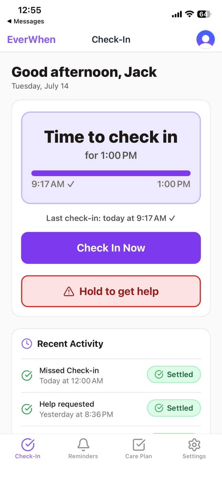
“Time to check in” · progress toward the deadline · one violet action.
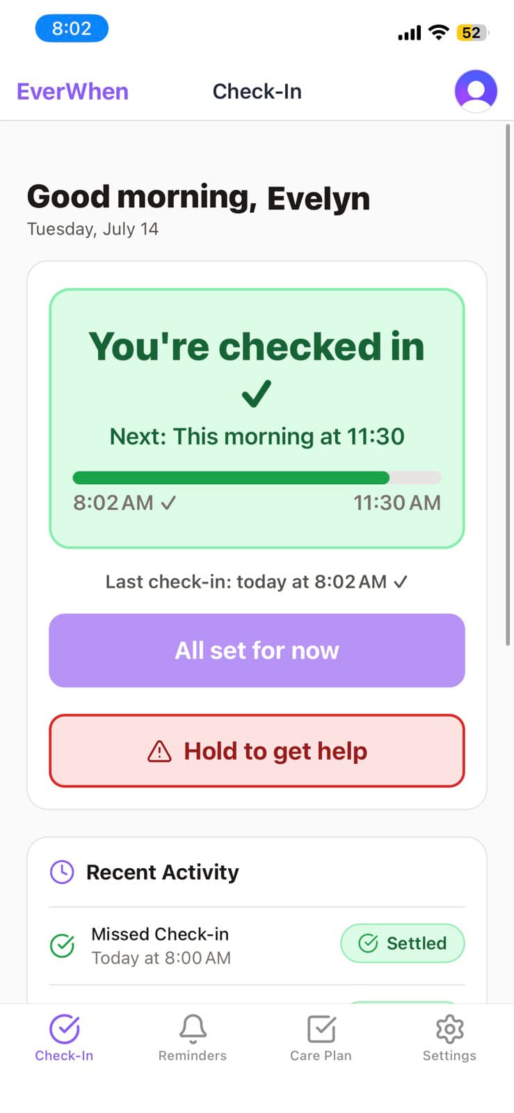
“You're checked in” · when the next one is · the action softens.
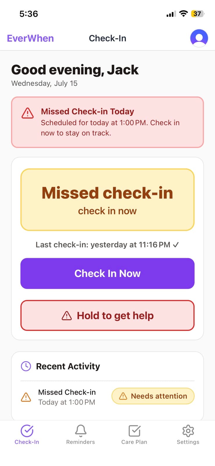
“Missed check-in / check in now” · banner above · same action, same place.
Composition laws
- 01Geometry does not move between states. The status block, the action and the help control stay put — muscle memory is an accessibility feature.
- 02One primary action per screen. If two things look equally pressable, neither is obvious.
- 03The help control renders in every state, including when everything is fine. It is not an error path.
- 04Vertical rhythm over decoration. Borders and space do the structural work; shadows stay almost invisible.
Across the product
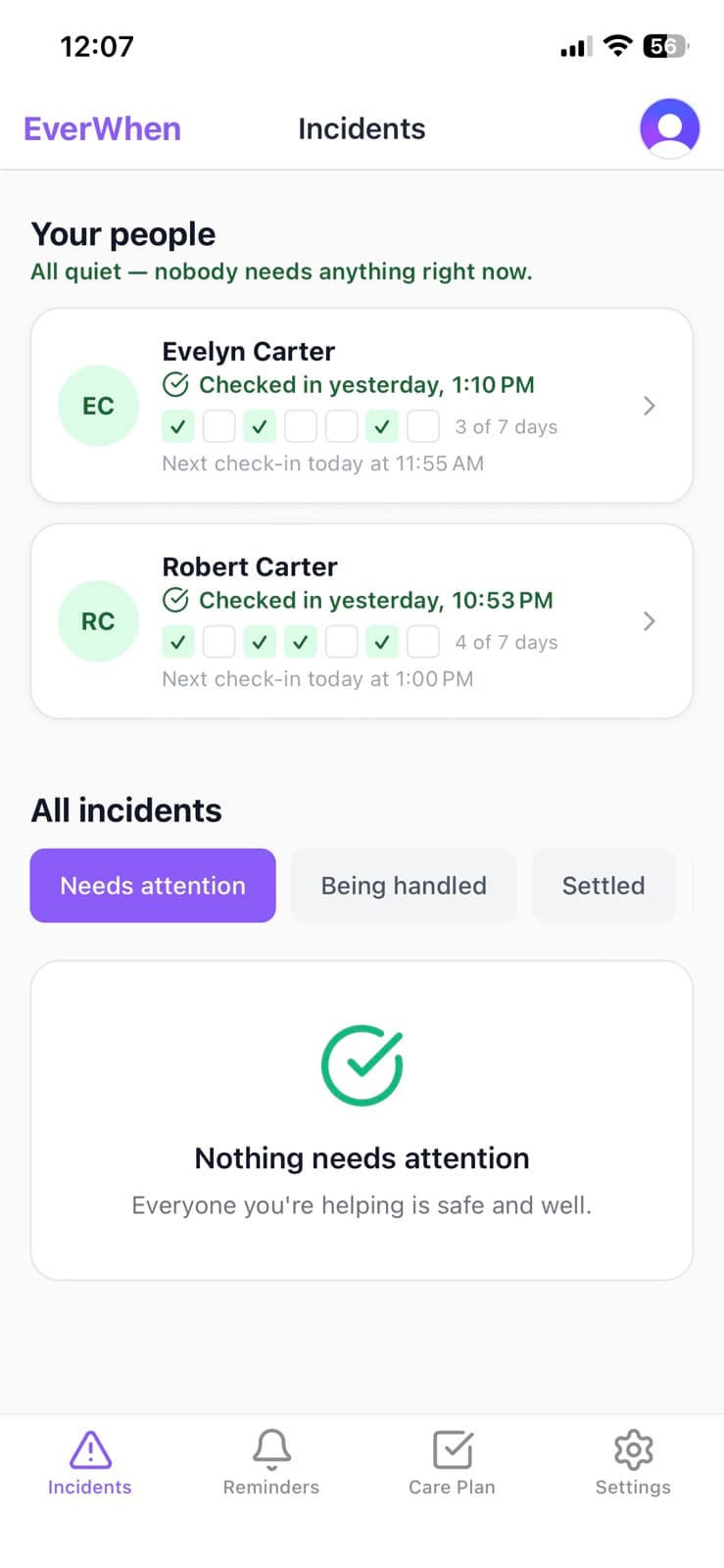
People before incidents. The all-clear is written in words.
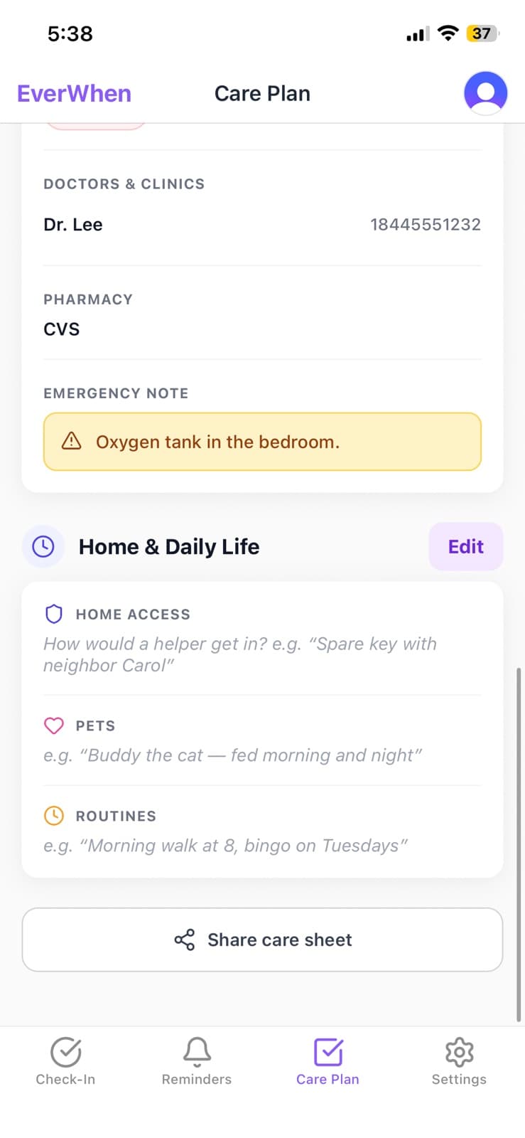
Emergency information sits above everything else on the screen.
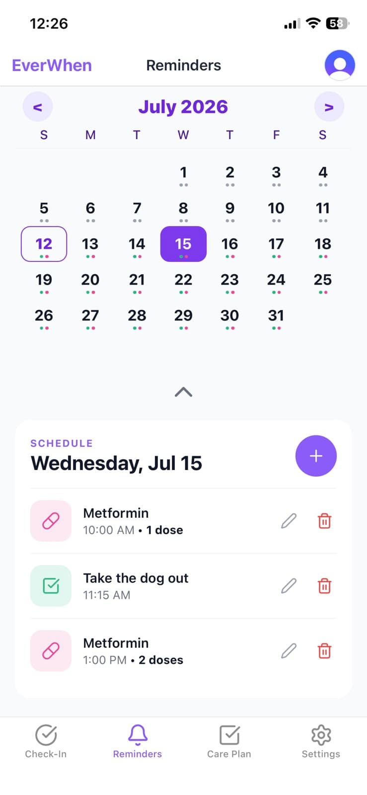
Large rows, plain times, one tap to mark a dose taken.
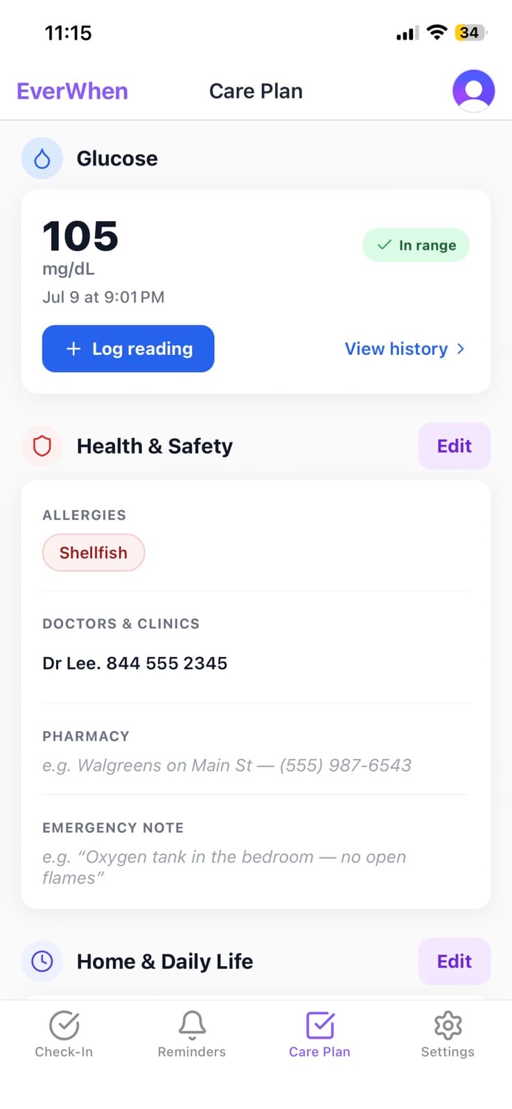
Numbers a family can read. Not a clinical chart.
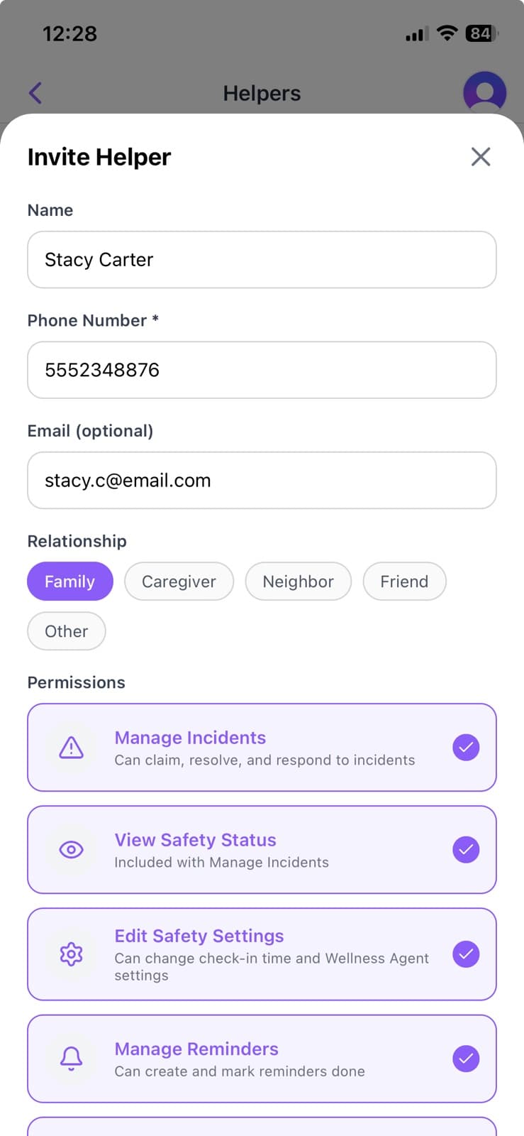
One field. The helper needs no account to respond.
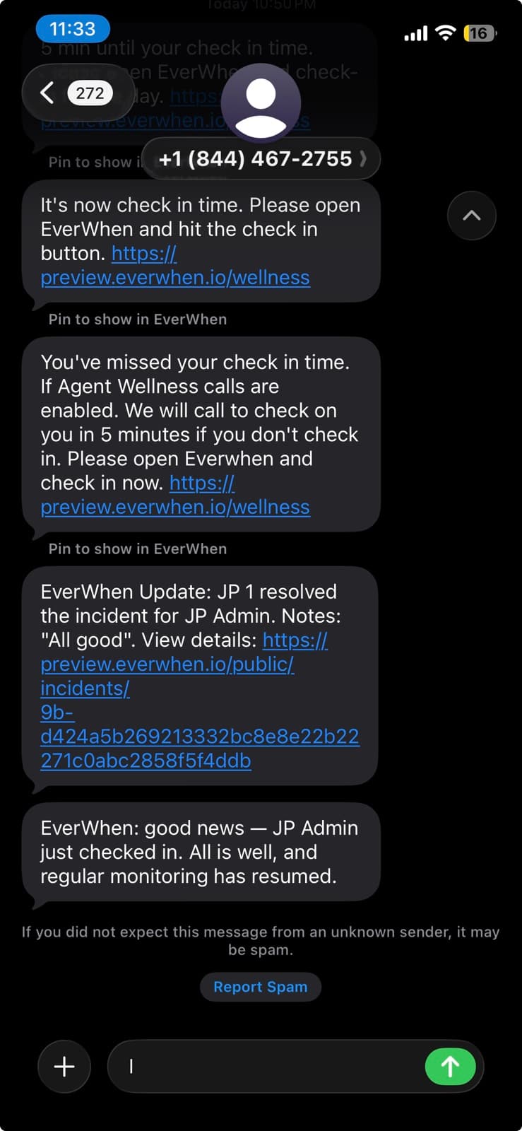
The brand off-app, where most escalations are actually read.
Reach & accessibility
These are acceptance criteria, not aspirations. A screen that fails any row here is not finished, regardless of how it looks.
WCAG AA everywhere; AA-Large is not sufficient for owner body text.
Layouts hold at the OS maximum. Product text scales to 1.4×; nothing clips or truncates.
44pt floor. 56pt for safety actions. 8px minimum separation between adjacent controls.
Every state readable in greyscale. Verified by rendering the screen desaturated.
Every control carries a label and, where the outcome isn't obvious, a hint.
Reduced-motion respected. No animation carries information.
Nothing urgent is reachable only by gesture.
Loading and error states keep their words. A bare spinner communicates nothing.
Plain English at roughly a 6th-grade reading level on owner surfaces.
Never implies EverWhen contacts emergency services.
EverWhen is not an emergency service, and no part of the interface may suggest otherwise.
Asking for help reaches a person's own care network — named people who chose to be there. No button dispatches anyone. Any message describing a serious situation names 911 as a separate, explicit instruction, and never as a link.
Name & mark
The wordmark is set type, not artwork. It is the only place in the system where letterspacing is adjusted.

Facts
Laws
- 01The wordmark is typography, not artwork — it is never redrawn, outlined, gradient-filled or given a shadow.
- 02Clear space on all sides equals the cap height of the E.
- 03Minimum legible size is 16px / 12pt. Below that, use the app icon alone.
- 04On photography it needs a solid plate. It never sits directly on an image.
- 05The app icon is a fixed production asset. It is never recoloured, cropped or re-cornered.
Never written as
Lowercase w. The historical form in the repo — never in anything a person sees.
Two words.
All caps, including in headings, SMS and email subject lines.
All lowercase. The domain is everwhen.io; the name is not.
No symbols in product or marketing copy.
Decided 2026-08-04: EverWhen, capital W, everywhere a person can see it. The repository, CLAUDE.md and internal docs still carry the older “Everwhen” form — harmless in code identifiers and package names, but every user-facing string needs auditing before launch: SMS and email copy, the voice agent's script, App Store and Play listings, and support articles.
Build reference
What is genuinely live in the product today, where it diverges from this document, and the tokens themselves. Nothing here is smoothed over — a designer opening the app should know what they're looking at.
Adoption
The two most-used colours in the mobile app. No competing hue anywhere.
#FAFAF9 across the app — the main reason it doesn't read clinical.
Five states, icon + word + tint, shared module driving app, SMS and email.
Seven components with the 44 / 56pt floors enforced inside them.
Specified as stone; most screens still carry cool Tailwind gray from before the tokens existed. New work uses stone.
Enforced inside the components; older hand-built screens still hold ad-hoc sizes.
Fully specified and built, shipped behind a disabled flag until more screens read tokens. Design light-first.
The one divergence worth knowing about
The tokens specify warm stone neutrals. Most screens still carry cool Tailwind gray from before the tokens existed. Side by side the difference is subtle; across a whole screen it is the difference between domestic and clinical. Design new work in stone and ignore the cool grays currently visible in the build.
Tokens
{
  "brand":  { "50":"#F5F3FF","100":"#EDE9FE","200":"#DDD6FE","300":"#C4B5FD",
              "400":"#A78BFA","500":"#8B5CF6","600":"#7C3AED","700":"#6D28D9" },

  "light":  { "canvas":"#FAFAF9","surface":"#FFFFFF","surfaceAlt":"#F5F5F4",
              "border":"#E7E5E4","textPrimary":"#1C1917","textSecondary":"#57534E",
              "textMuted":"#79716B","textOnAction":"#FFFFFF",
              "brandAction":"#7C3AED","brandAccent":"#8B5CF6",
              "brandTintBg":"#EDE9FE","brandTintBorder":"#C4B5FD","brandTintText":"#5B21B6",
              "dangerAction":"#DC2626","ringTrack":"#E7E5E4","overlay":"rgba(28,25,23,0.5)",
              "status": {
                "safe":       {"fg":"#16A34A","bg":"#DCFCE7","border":"#86EFAC","text":"#166534"},
                "attention":  {"fg":"#D97706","bg":"#FEF3C7","border":"#FCD34D","text":"#92400E"},
                "urgent":     {"fg":"#DC2626","bg":"#FEE2E2","border":"#FCA5A5","text":"#991B1B"},
                "inProgress": {"fg":"#2563EB","bg":"#DBEAFE","border":"#93C5FD","text":"#1E40AF"},
                "paused":     {"fg":"#4F46E5","bg":"#EEF2FF","border":"#C7D2FE","text":"#3730A3"} } },

  "dark":   { "canvas":"#111318","surface":"#1C1F26","surfaceAlt":"#232730",
              "border":"#2A2E37","textPrimary":"#F5F5F4","textSecondary":"#C7C2BD",
              "textMuted":"#948E88","textOnAction":"#FFFFFF",
              "brandAction":"#8B5CF6","brandAccent":"#A78BFA",
              "brandTintBg":"#27203B","brandTintBorder":"#453768","brandTintText":"#C4B5FD",
              "dangerAction":"#E5484D","ringTrack":"#2A2E37","overlay":"rgba(0,0,0,0.6)",
              "status": {
                "safe":       {"fg":"#4ADE80","bg":"#14261B","border":"#245C38","text":"#86EFAC"},
                "attention":  {"fg":"#FBBF24","bg":"#2B2210","border":"#5C4A1D","text":"#FCD34D"},
                "urgent":     {"fg":"#F87171","bg":"#2A1517","border":"#5C2626","text":"#FCA5A5"},
                "inProgress": {"fg":"#60A5FA","bg":"#14213B","border":"#28497A","text":"#93C5FD"},
                "paused":     {"fg":"#818CF8","bg":"#1B1E3B","border":"#39406E","text":"#A5B4FC"} } },

  "fontSize":  { "display":32,"title":24,"heading":20,"body":17,"secondary":15,"caption":13 },
  "spacing":   { "xs":4,"sm":8,"md":12,"lg":16,"xl":20,"xxl":24,"xxxl":32 },
  "radius":    { "sm":8,"md":12,"lg":16,"xl":24,"pill":999 },
  "tapTarget": { "min":44,"safety":56 }
}
Mirrored from packages/shared/src/theme.ts. One file feeds both the mobile and web apps. If a design needs a colour that isn't in it, the answer is almost always a different token — or a conversation about whether the meaning is genuinely new.
Handing this to someone else
To a human designer
Send this page and the app itself. Say which screens are owner-facing and which are helper-facing — the constraints differ sharply and nothing on screen labels which is which.
To an AI design tool
Give it this page's URL and the token block below, then state the audience in one sentence. Without that sentence every tool produces something young, clean and wrong for this product.
To a contractor or agency
Chapters 02, 06 and 11 are the acceptance criteria. Work that fails those is not finished, however it looks in a deck.
Design tools default to the wrong audience — young, sighted, unhurried. Stating who this is actually for is the single highest-value sentence you can give them.
Design for EverWhen, a safety app for people who live alone
and the family who would want to know.

Audience: the person using this is often in their 80s, reading at the
largest text size their phone offers, sometimes without glasses, and
sometimes frightened. A second audience — their adult child — reads
alerts on a lock screen, half-awake.

Non-negotiable:
  - One obvious action per screen. Nothing below 15pt, nothing under 44pt to tap.
  - State is always icon + word + tint. Never colour alone.
  - Warm stone neutrals, one violet (#7C3AED) as the only action colour.
  - Plain language. No system words, no medical words, no exclamation marks.
  - Never imply the app contacts emergency services.

Use the attached tokens exactly. Do not introduce a second brand colour,
a display typeface, or a colour that has no assigned meaning.
One-page card
Everything above, compressed to what fits on a single sheet. Print this one page and pin it up.
- 01One violet action per screen.
- 02Icon + word + tint. Never colour alone.
- 03Missed is amber. Red means escalated.
- 0415pt floor on owner screens.
- 0544pt to tap. 56pt to save someone.
- 06Warm stone, never cool gray.
- 07Name the person. Say the time.
- 08What happened, then what to do.
- 09911 stated separately, always.
- 10Help renders even when all is well.
Design for trust, not for attention.
EverWhen brand & interface specification · 1.0 · August 2026 · derived from packages/shared/src/theme.ts